

User Interface Design in Museum Interpretation: How UX/UI Shapes the Digital Experience
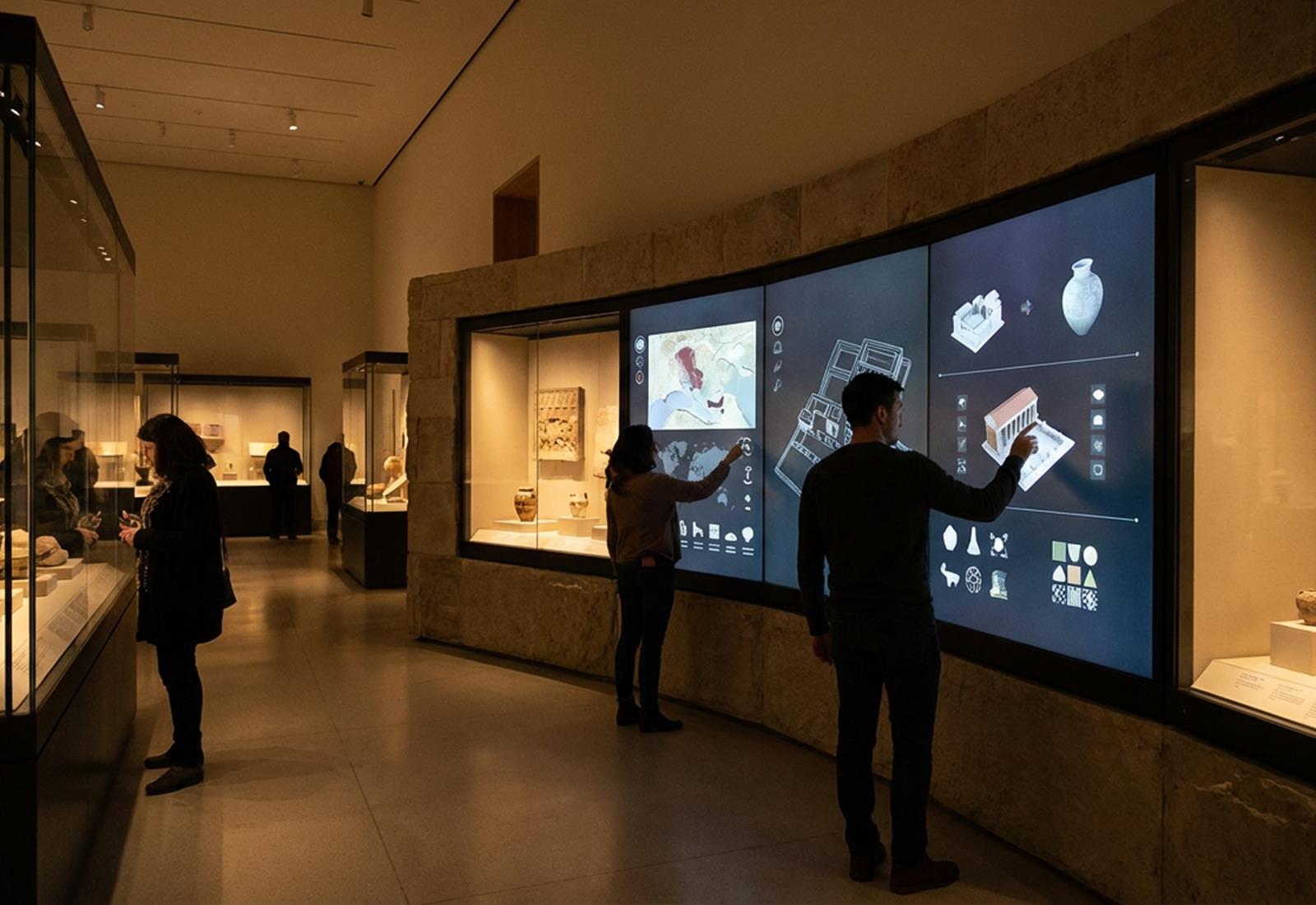
What does UX/UI mean in museums?
User interface (UI) and user experience (UX) design in museums has become a key element of digital interpretation, because it determines how easily and intuitively visitors can use interactive screens, kiosks, or apps. These systems must be designed for very different user profiles—from young children to older adults, people with disabilities, or tourists who don’t speak the local language. Clarity, simplicity, and adaptability are the core rules of UX/UI design in a museum setting.
How does interface design work?
Large touchscreens in museums require a specific approach because they differ from design for mobile devices or computers. On-screen elements must be larger, since people tap with their fingers while standing, and the design must account for users’ field of view and arm reach. Jakob Nielsen from the NN/g group emphasizes that the top areas of very large screens are often underused simply because they’re too high—so interactive elements should be placed in the lower two-thirds of the screen to keep use comfortable. High-quality UX design also considers the screen’s tilt angle, the lighting in the space, and reflections, so interaction feels smooth and effortless.
Accessibility for all users
One of the foundational principles of modern design is accessibility. Digital kiosks should include options for visitors with low vision, such as high contrast, larger fonts, or audio narration. They should also provide transcripts of audio content for deaf visitors and audio descriptions of images for blind visitors. Multilingual support is especially important in museum interpretation because audiences often come from different countries—a simple language selection button that automatically translates the entire interface is essential for creating an inclusive experience. Accessibility shouldn’t be treated as an add-on, but as a required standard.
Tools and technologies
UX/UI designers in the museum sector use tools such as Figma, Adobe XD, or Sketch for interface prototyping and end-user testing before implementation. Once a prototype is validated, the development team uses web technologies like HTML, CSS, and JavaScript, optimized for touchscreens, to build the final product. For mobile apps, it’s important to follow Android and iOS platform guidelines, especially regarding accessibility. Modern museum software often already comes with predefined UX solutions: it offers customizable themes, multimedia integration (images, video, audio), and even augmented reality (AR) modules—so visitors can access additional layers of information when, for example, they scan a QR code.
Consistency and optimization
Design consistency matters so visitors recognize the museum’s visual identity whether they’re using a kiosk, a mobile app, or a website. This includes using the same icons, colors, and styles, ensuring users intuitively understand how to navigate the content. Another important trend is responsive design: the same content must be optimized for different devices and resolutions. For example, a virtual guide can be available as an interactive kiosk in the museum, and also as a mobile app, delivering a consistent experience in both cases.
How do interfaces guide visitors through museum stories?
Well-designed UX/UI enables museums to create digital content that is accessible, compelling, and engaging for the widest possible range of visitors. This way, museums don’t just modernize their exhibitions—they also expand their impact, allowing audiences to connect with their content in completely new ways.